Last week the folks from #makeovermonday selected a dataset related to international and domestic tourism in New Zealand (aka Australia’s Australia by John Oliver).
From the start I planned to do a visual visualization (OMG!), meaning, I wanted to highlight the beauty of the country by building an easy and interactive data postcard. So I went searching for a picture and the first one I got was this:

And I loved it because I felt I could blend data right below it and made the transition seamless. Also I could place some transparent logos at the top and finally blend in the interactive parts, filters.
The data part was pretty straightforward as I highlighted the RTI (Regional Tourism Index) by using data under circle shapes (kind of something I like doing) and complemented them by building a sparkline. Funny enough for some regions the sparkline would resemble the highs and lows of the picture above.

All colors that you see on this section were taken from the picture above. For that, first I used a layout container and selected the background color to be the blue color near the bottom of the screen. Then I used the same color to build the color range for the circles and the sparkline. Finally I picked the year color from the gray tones at the top of the mountain.
Then it was the task to blend it all together. I started by making my dashboard the width of the background image. Then I’ve floated the image in and placed it at the very top. Next I adjusted the height of the dashboard to fit the data element and it was nice to play with the Layout position feature in Tableau:

The next element to add was the filters. I’ve decided to allow users to select the type of visit (International vs Regional) and then select the Regions from the dataset. Here I had to rename the region “TLAs (All)” to “All Regions”, which allowed me to remove the filter name from the screen:
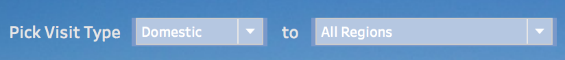
I also tried to pick the same blue from the background but sometimes Tableau does not make it 100% accurate selection. So I’ve reduced the layout container that held the filters to a minimum to make it blend in almost like I wanted.
After adding a title, a nice New Zealand government logo for tourism I was done. Or was I? Well, at the last minute I’ve decided to add an (i) icon at the top so that I could add the explanation about the index. That I did by adding a the SUM of Regional Tourism Indicator to Shape and making the shape as the (i) icon.

This allowed me to add a tooltip to it and I was done with that part.
So I was ready right? Eva Murray then reminded me about adding a source information for the image and yes that is something I had to do. And finally I was done… Here is the Viz:

And this Viz was then selected as one of the highlights of the week. What xan honor!
Later on Friday then some controversy came around using images available in the internet and copyright so I’ve decided to switch the image to a “public domain one” that I found in flicker and now I got a secondary view for this:

What I take from week 4 of #makeovermonday? Well, you can really excel in data visualization by making the data look simple (it will reach broader audiences) and a nice blending will make it pop automatically.
